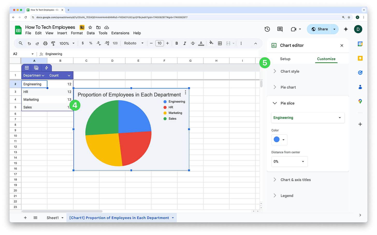
Gemini has been able to create charts in Google Sheets for a while but Google just dropped a new update which means those charts are now editable! (Previously they were static images.)
This update means you can generate a chart based on your data before customising it to your preferred look and feel. Here’s how:
Open the Gemini side panel in Google Sheets
Ask Gemini for the type of chart you’d like and what you’d like the chart to show
Click ‘Insert’
Double click on the chart to open the chart editor
Change anything from fonts to colours and axis titles

That’s it! Super helpful if you’re not confident creating charts.
Looking for more?
See you next week for another Google Workspace tip!
Dean

